DC Dashboard design
This presentation contains current design ideas for the DC Dashboard. It tries to answer to the need of providing a summary showing the key figures.
It also remains a tool for exploring and drilling down to details. To achieve this I revised the map and included it on a new summary page. I believe this results in a sensible navigation for the dashboard.
Use your keyboard or the arrows at the bottom to navigate the slides
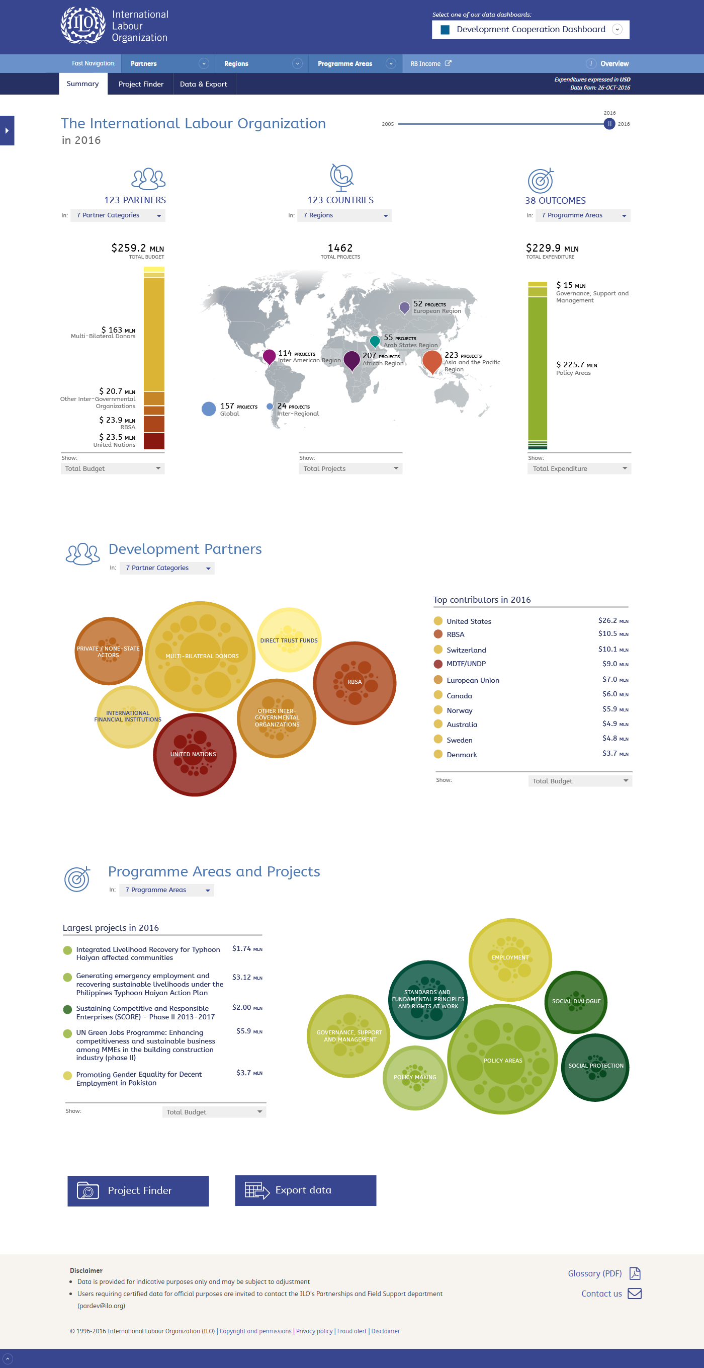
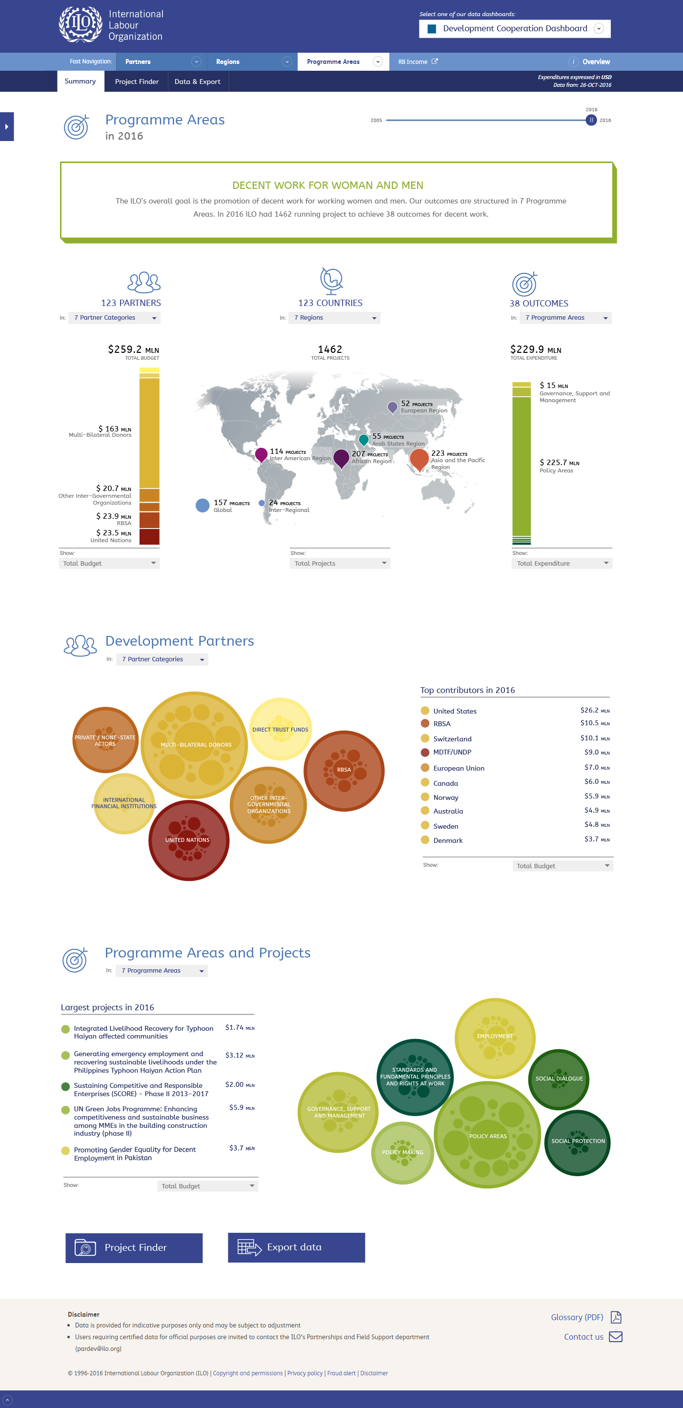
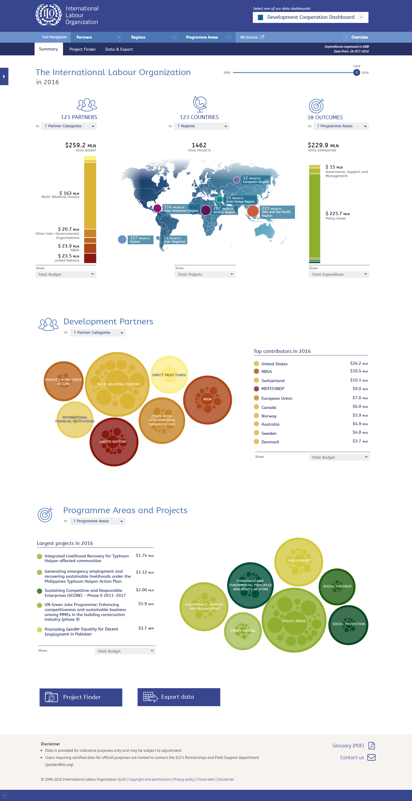
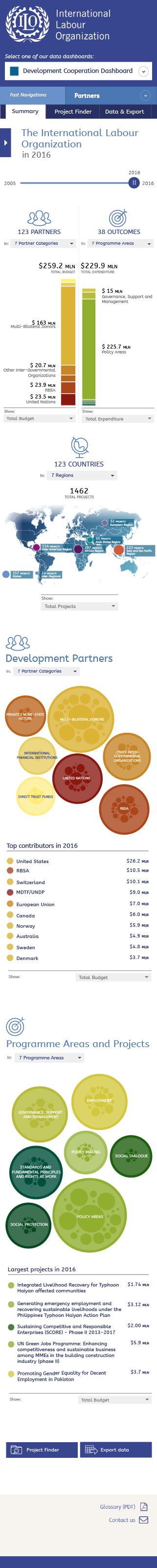
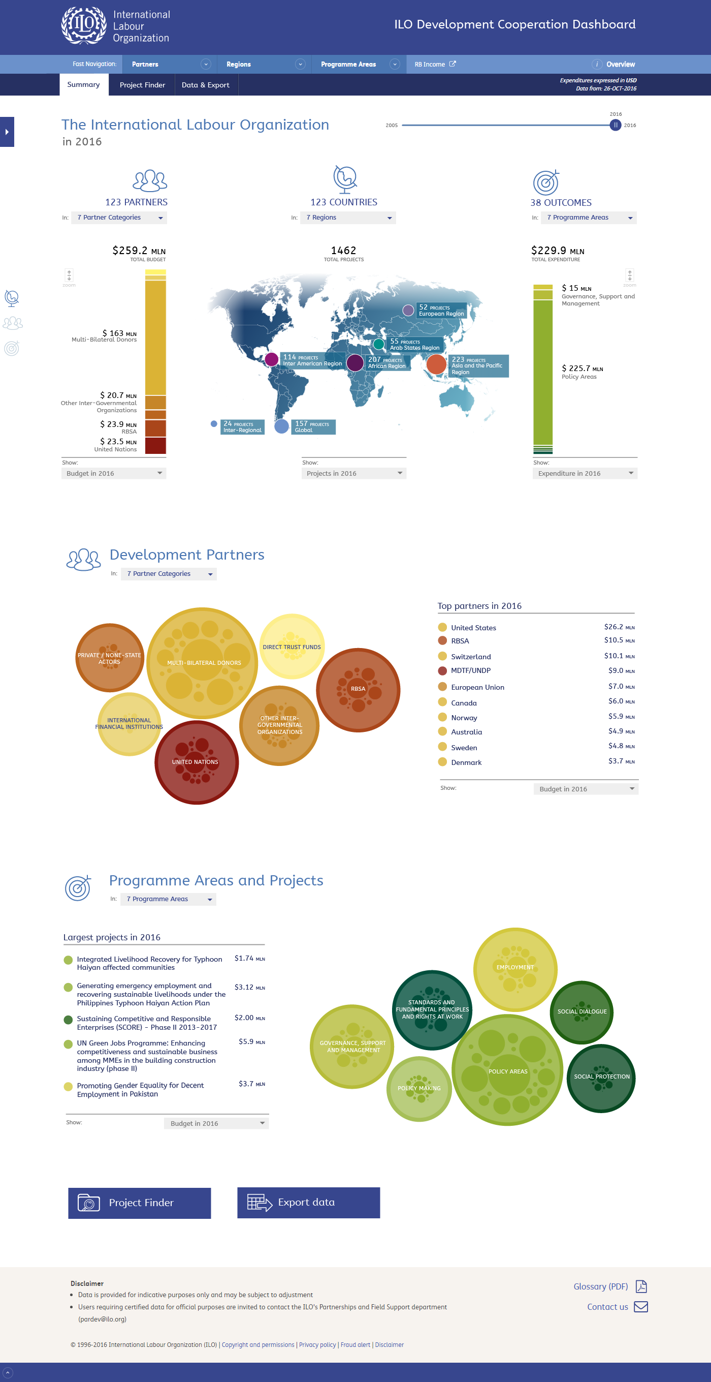
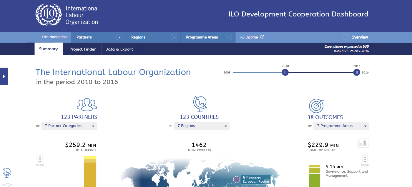
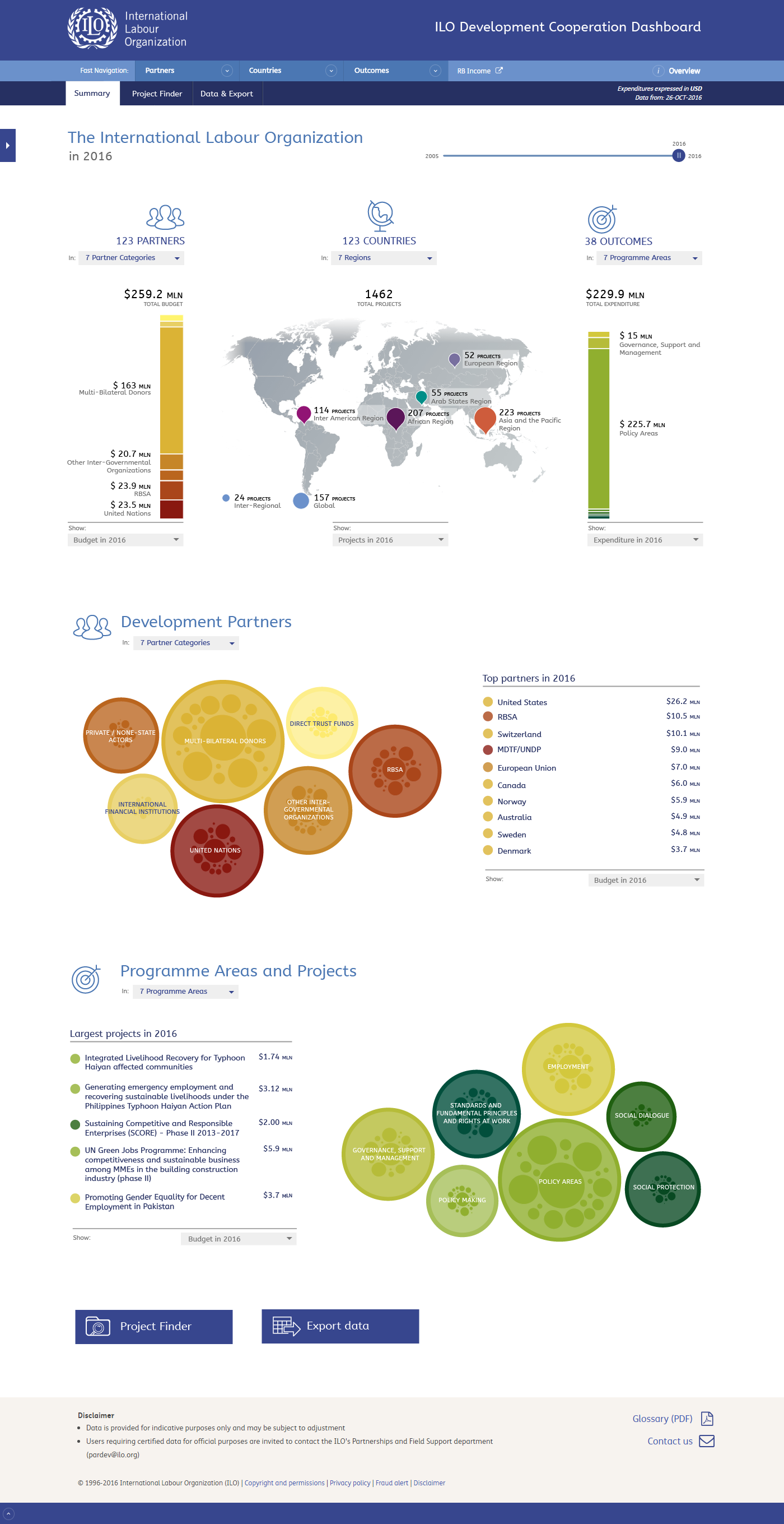
The main page of the DC Dashboard. The map is now more focused on showing the global picture. You can still drill down in using this view, however the visualizations below the map (the large bubbles) and the menu will now become more suitable for this task.
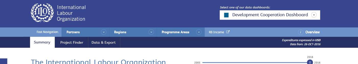
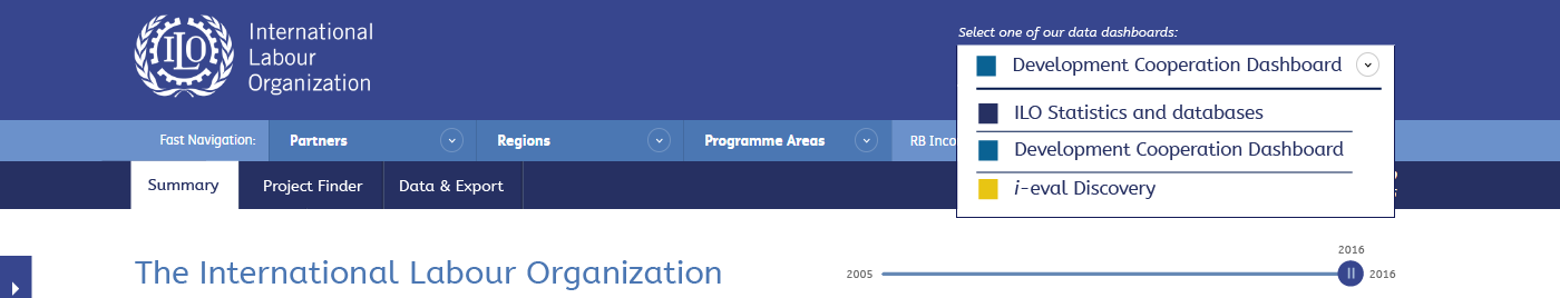
Maybe we could add a select field in the header of the page showing the current environment. It will allow users to easily switch between on and another.
We need to take care to make each dashboard look distinct enough to prevent confusion, while also trying to promote the idea of a single environment for all information and a consistent way of communicating that information.
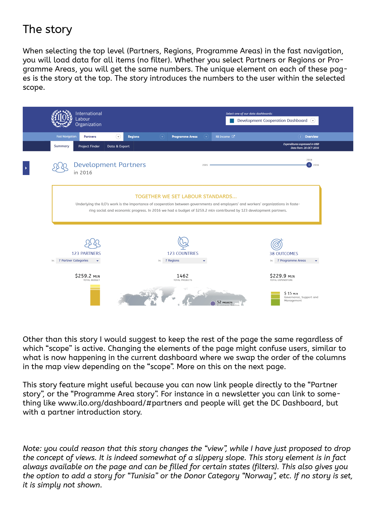
The "Fast Navigation" will still provide users with quick access to filters. For instance finding a country and getting results for it. Clicking on the top level ("Partners", "Regions" and "Programme Areas") will give you the summary page without any filters, however we will add an introduction text on the top, introducing the global story for each of these topics.
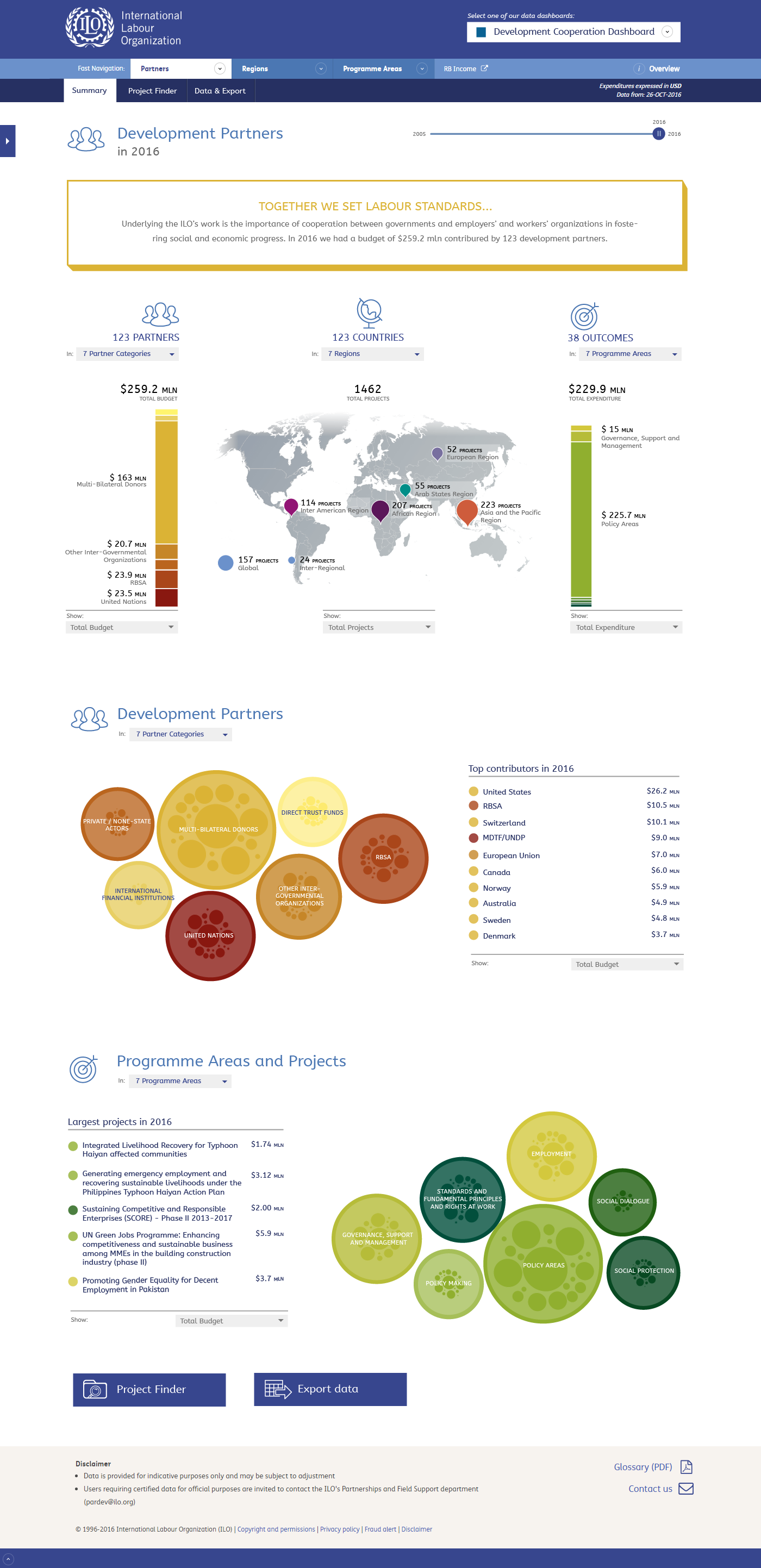
Clicking on Partners from the Fast Navigation will give you an introduction story. When you drill in from here, the message will again be removed.
The design of this story block will most likely need some more attention, however this shows the concept I am aiming for.
For Programme Areas we have a different story and a different colour. Again, this still needs some more design work.
Maybe it would be have a story for each Programme Area (or even each Outcome) to tell what it is about and what the ILO has achieved.
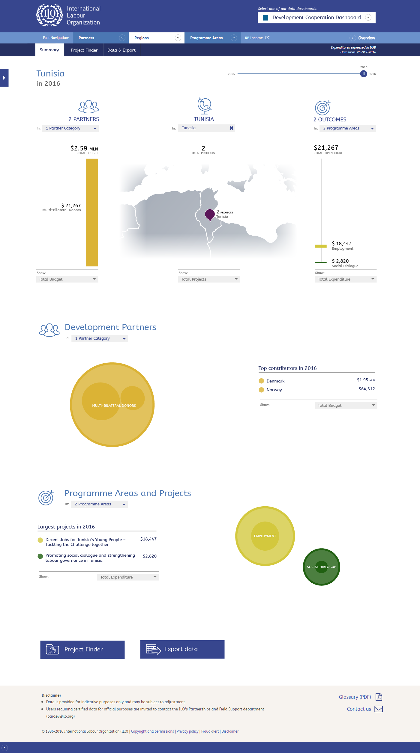
Through the menu you can also quickly select the summary page for a donor, outcome, region or in this case country.
Back to the mainpage. From here we can drill down to details, as we will see this can be done in multiple ways. By using the map, or the bubble visualizations below.
When drilling down the content of the whole page will be updated accordingly.
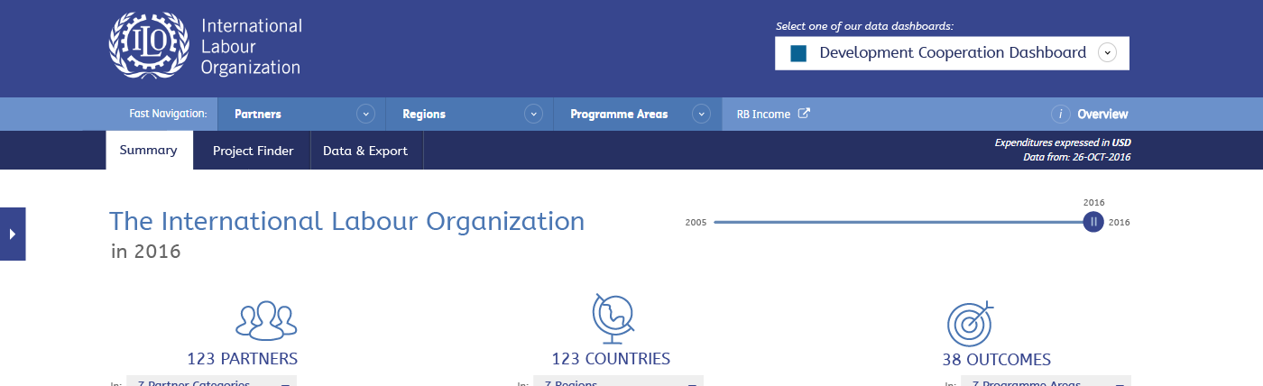
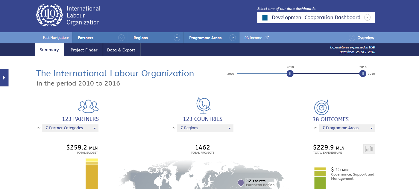
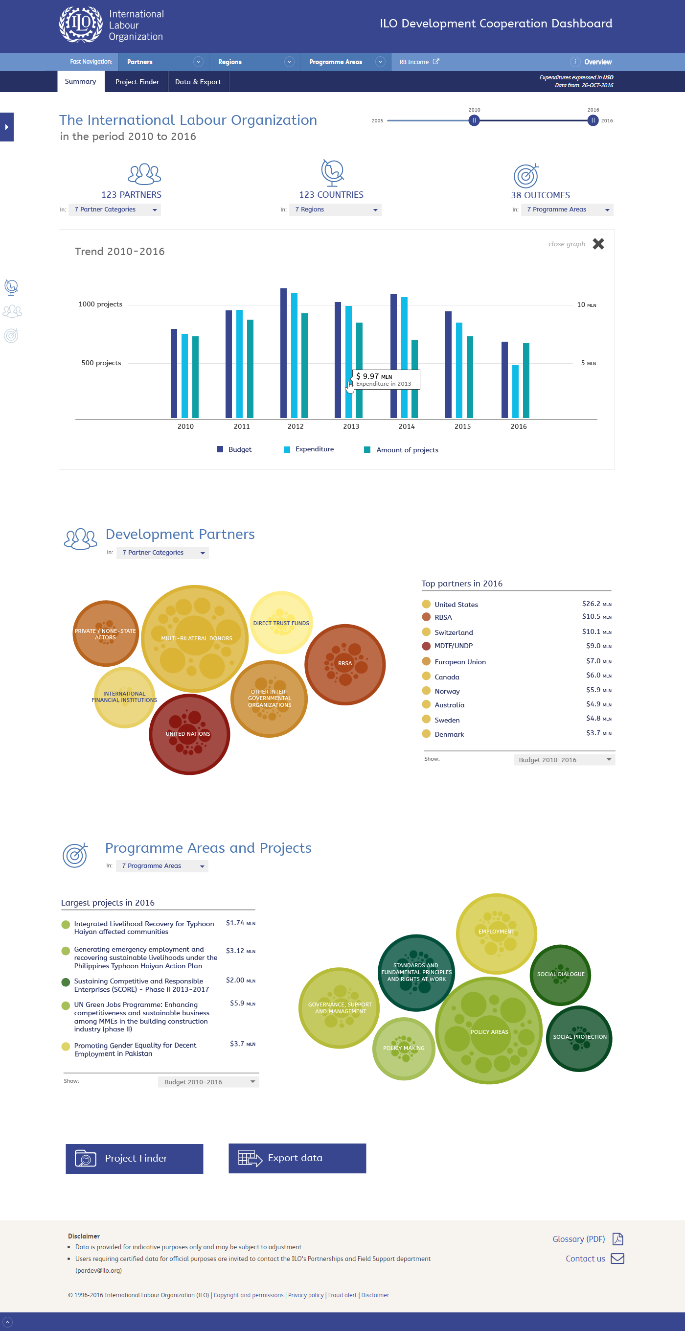
By default the year slider is set to the current year. There are two 'thumbs', that are placed on top of each other. When you drag the thumb, you will be able to set a range of multiple years. Put both thumbs on top of each other to select a single year.
Note that when selecting a range a "show graph" button will be displayed in the row of the total budget/projects/expenditure. Clicking this will open a graph showing the trend of these dimensions (design follows).
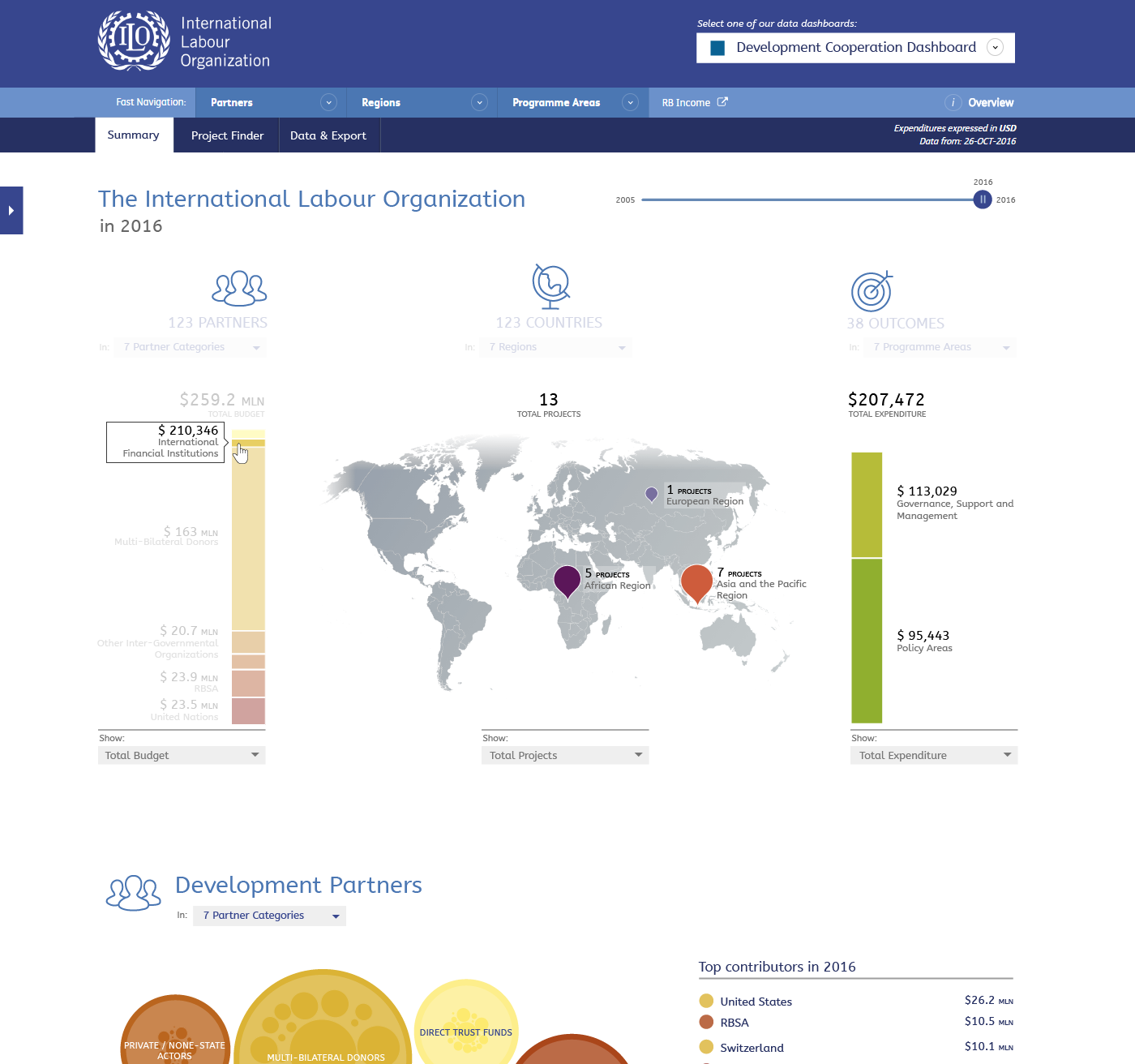
Mouse-over will work on each of the items and will isolate it. It will show all amounts in the other two dimensions for the active item. Click it to drill down to that item.
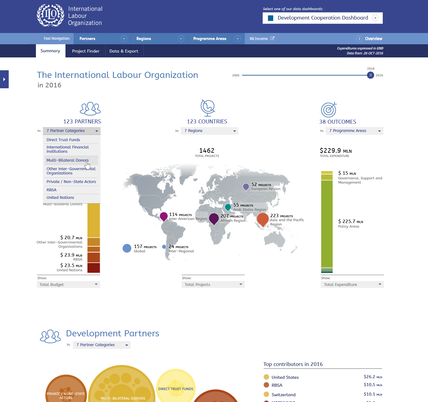
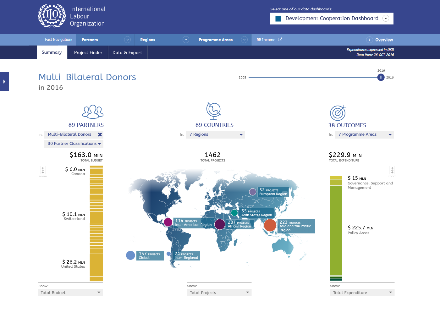
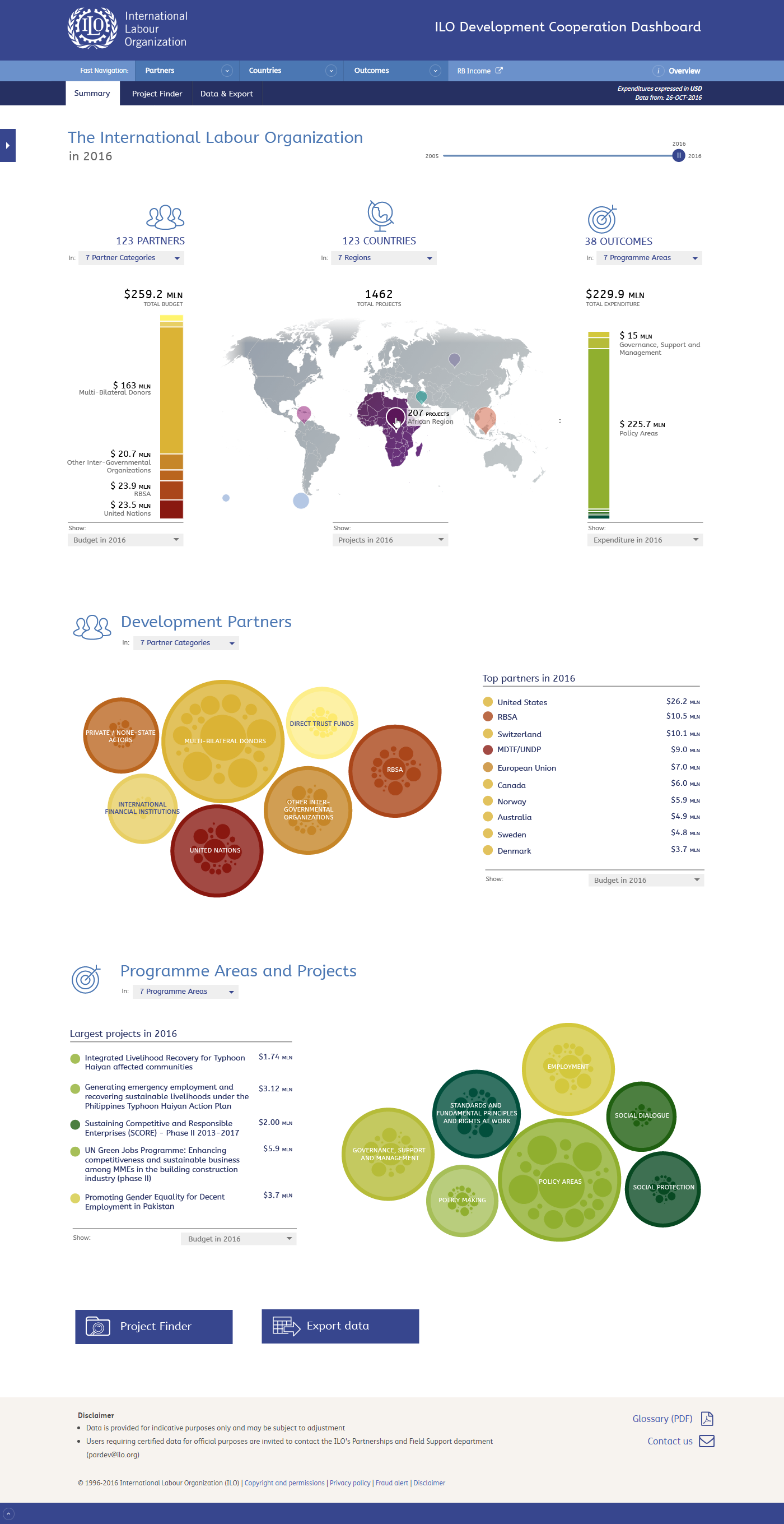
As mentioned before, you can drill down by clicking items on the bar chart or in the map, however to make it easier to select items you can also use the drop down selects. Once a new dimension is selected the content of the whole page will be updated accordingly (see next slide).
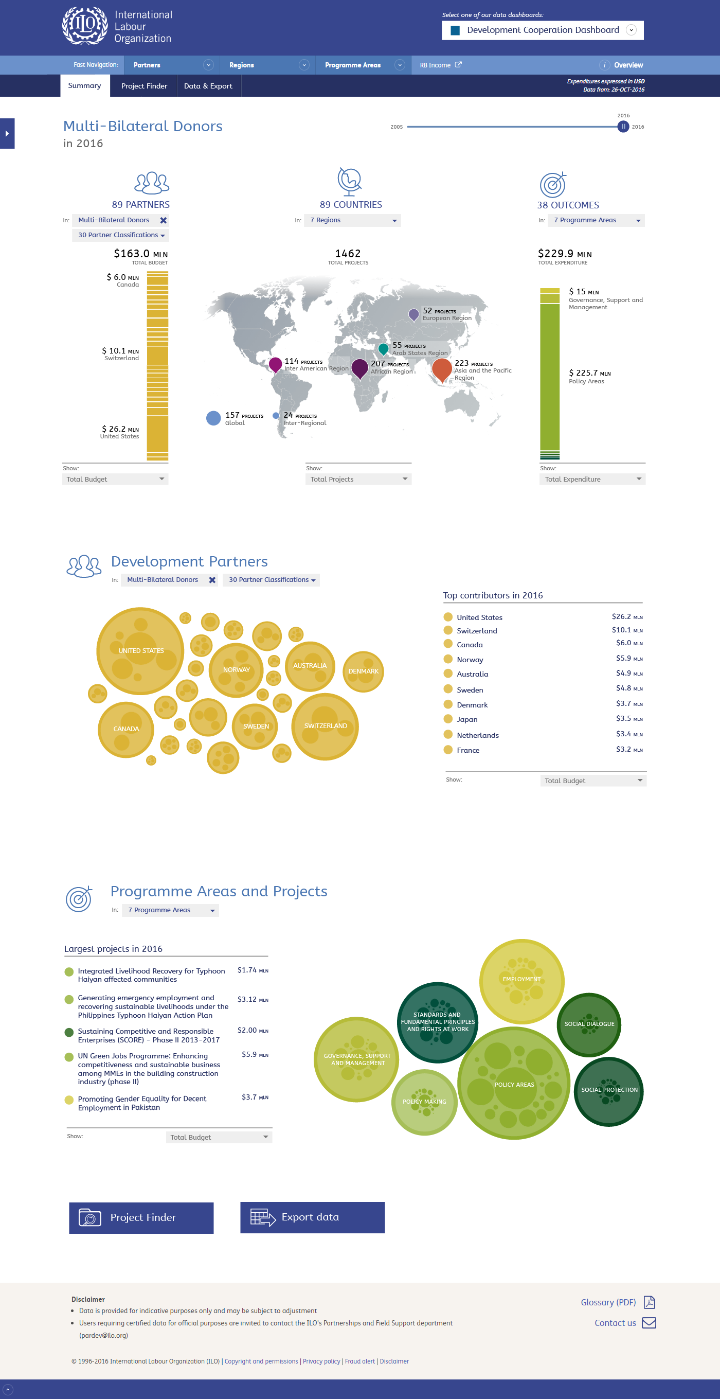
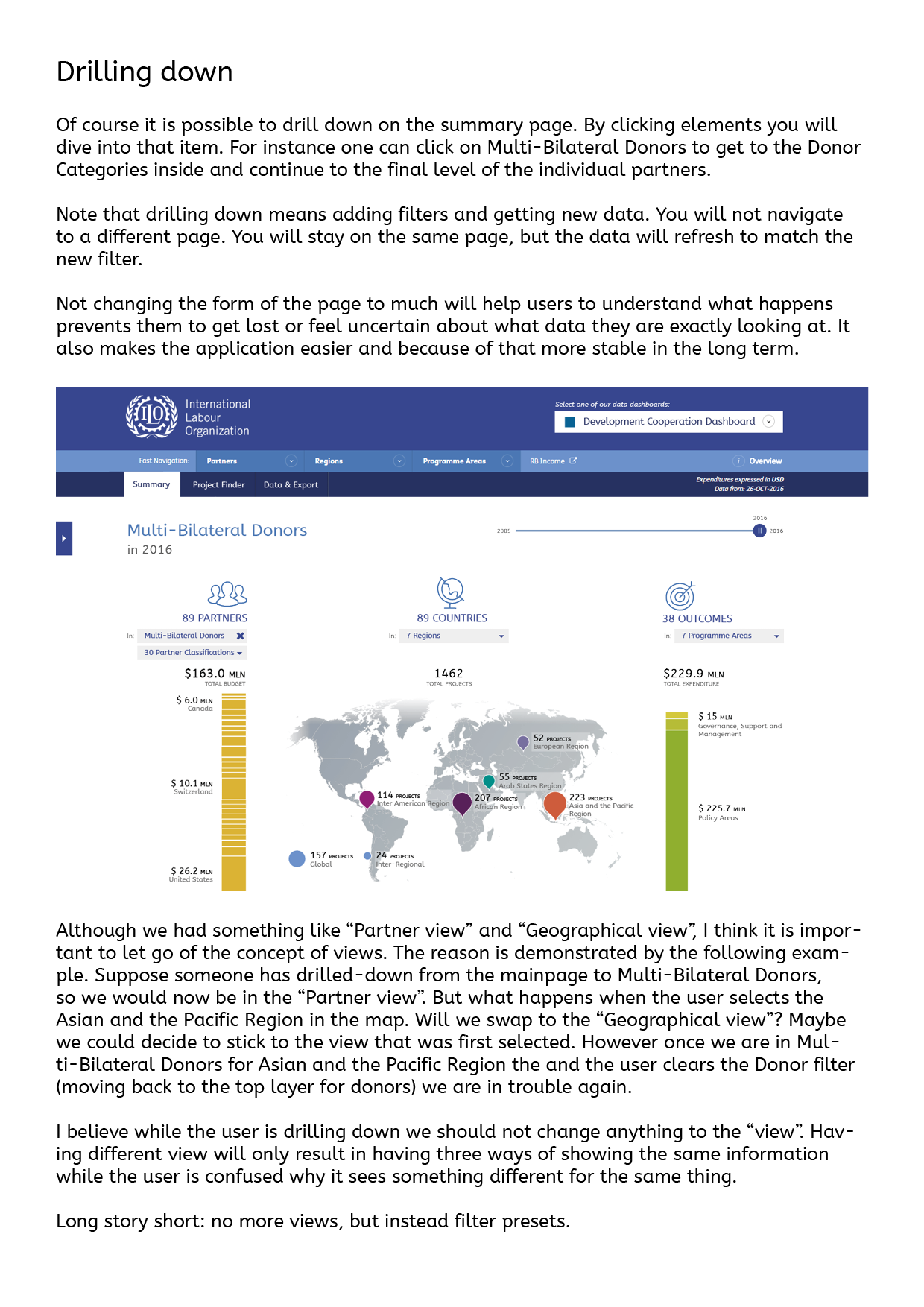
Here the donor category "Multi-Bilateral Donors" is selected. This updates the title of the page, the map, and the donor visualization (bubbles). The active filter is show at the appropriate column in the map and in the donor section with the bubbles. Pressing the blue cross in this active dimension will delete the filter and you will navigate 'up' to where you started.
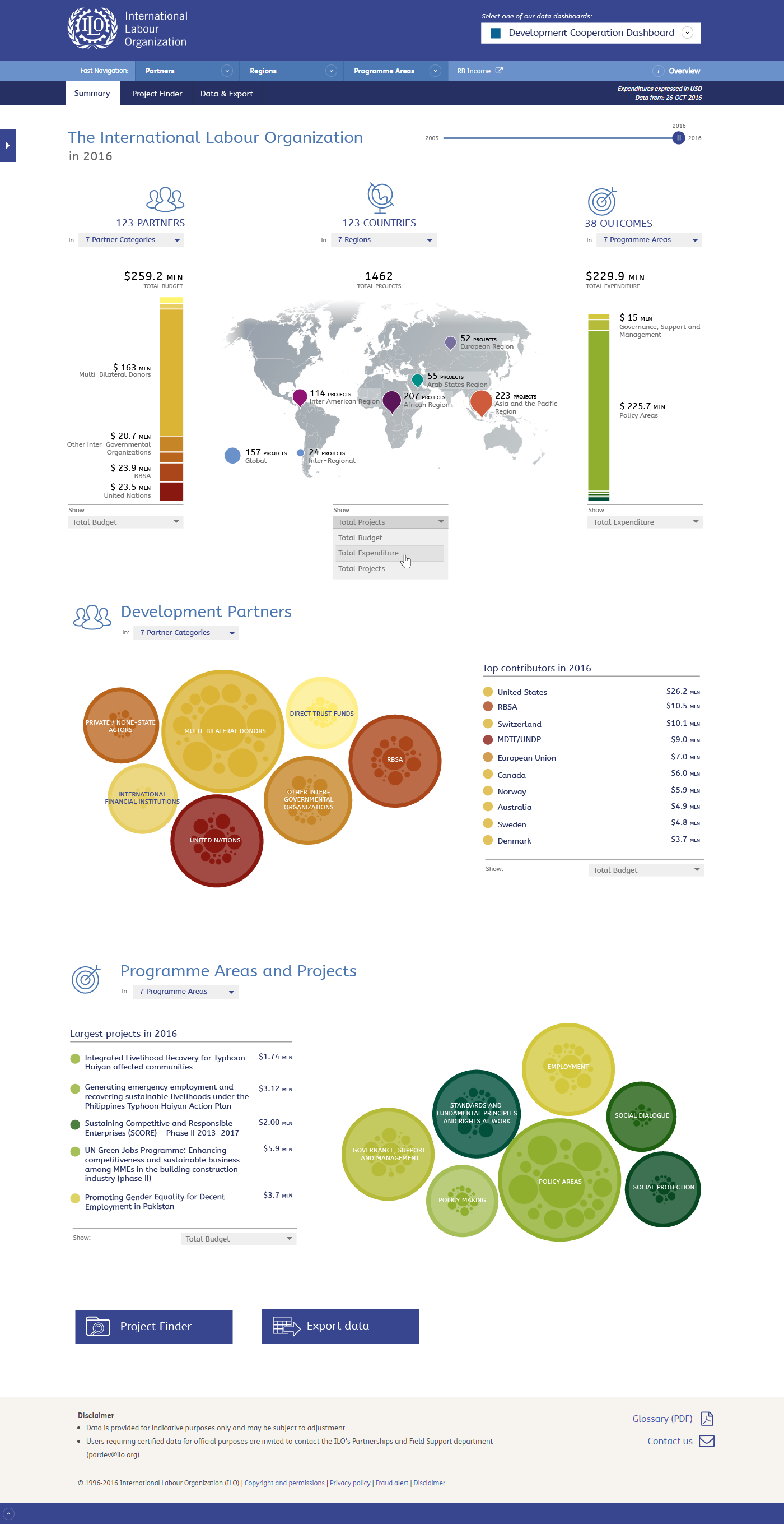
Where amounts are being displayed the user can choose the dimension. You can select budget, expenditure or amount of project. For the map view my suggestion is to initially show budget for donors (what is made available), project count for regions (where work is being done) and expenditure for outcomes (on what it is spend). Mixing all three dimensions instantly gives users the complete picture.
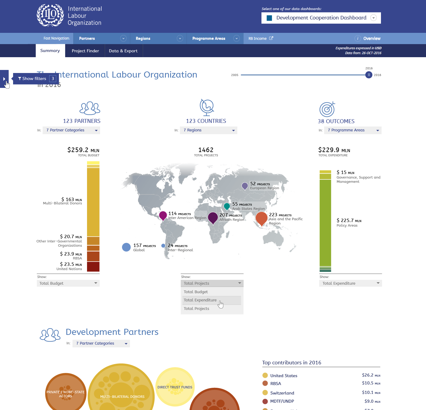
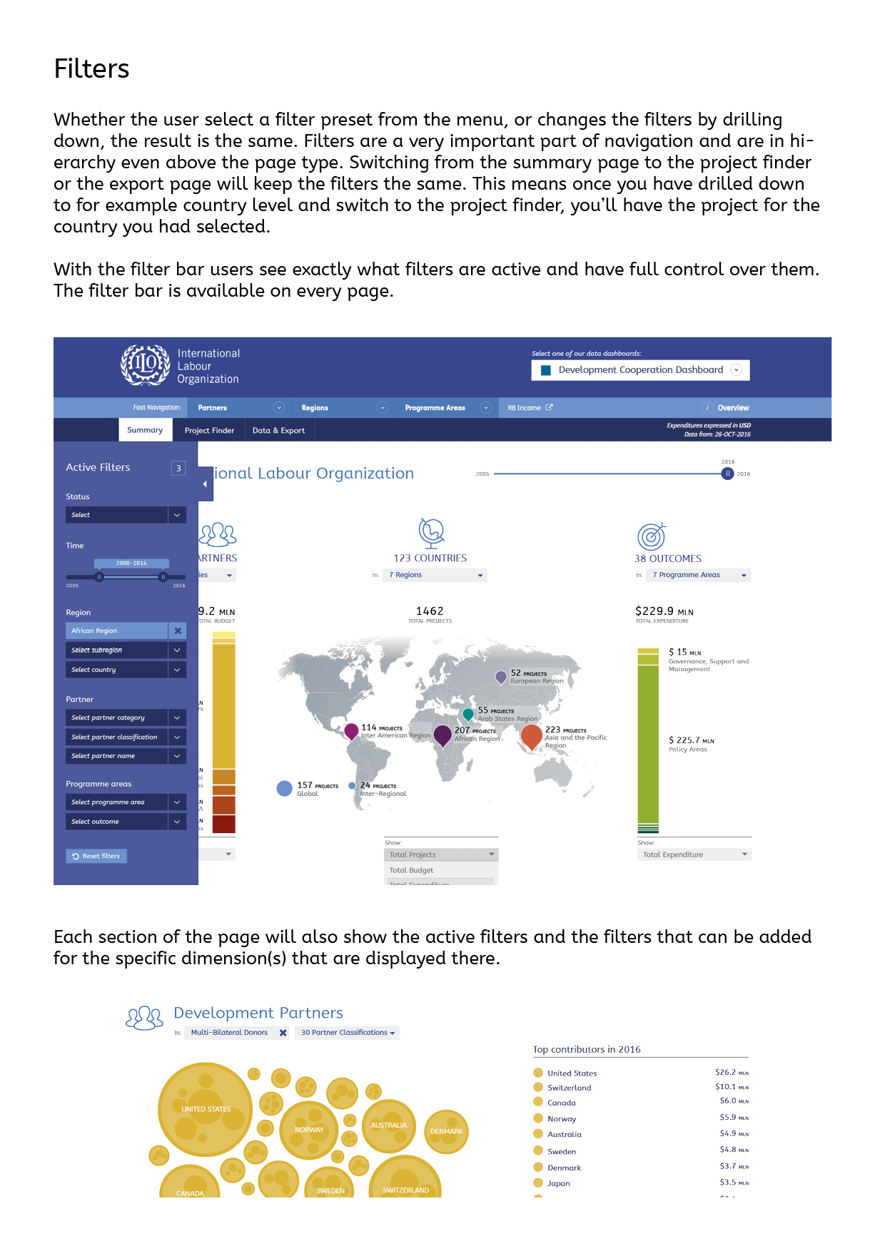
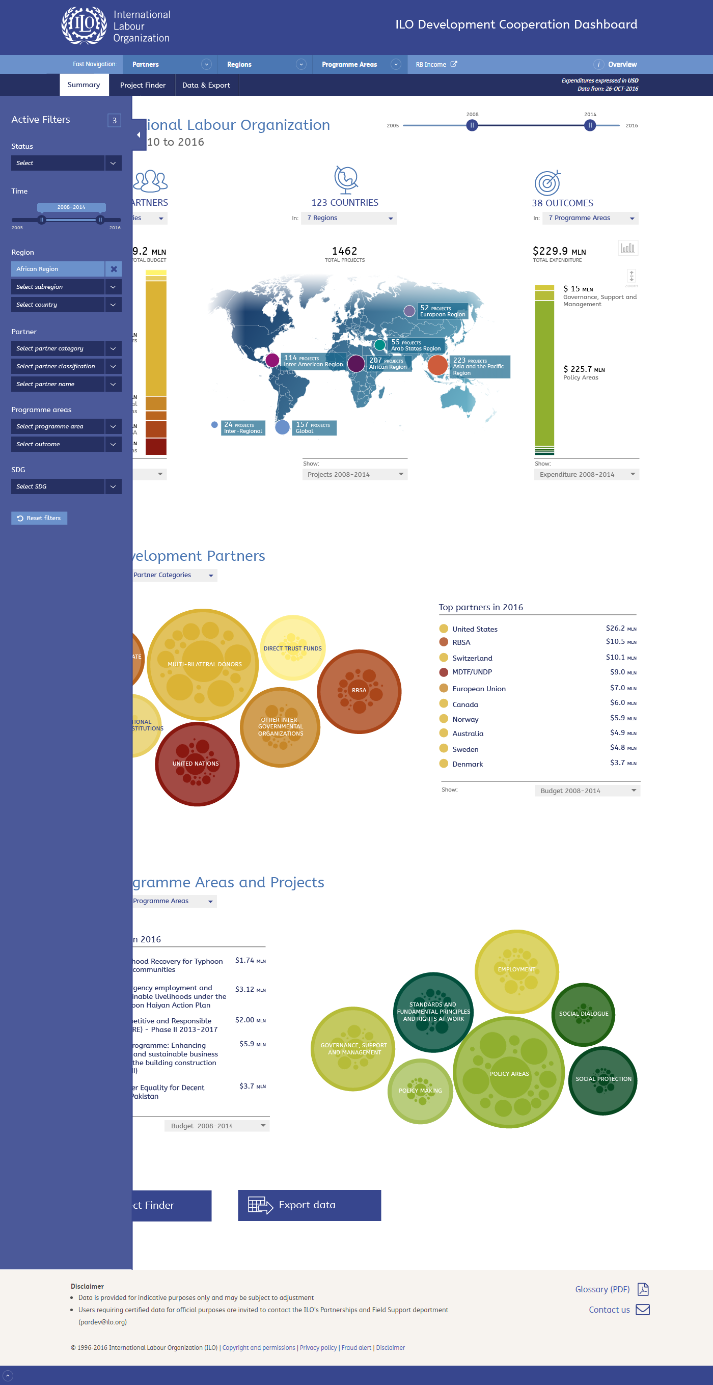
On the left side of each page there is a blue square to expand the filter bar. On a mouse-over a tooltip is shown (this is shown here). Each time a new filter is added there will also be a small animation which shows the count of active filters. It will indicate the user has added a filter and it can be accessed here. In the Project Finder and Export page, the bar will be open by default.
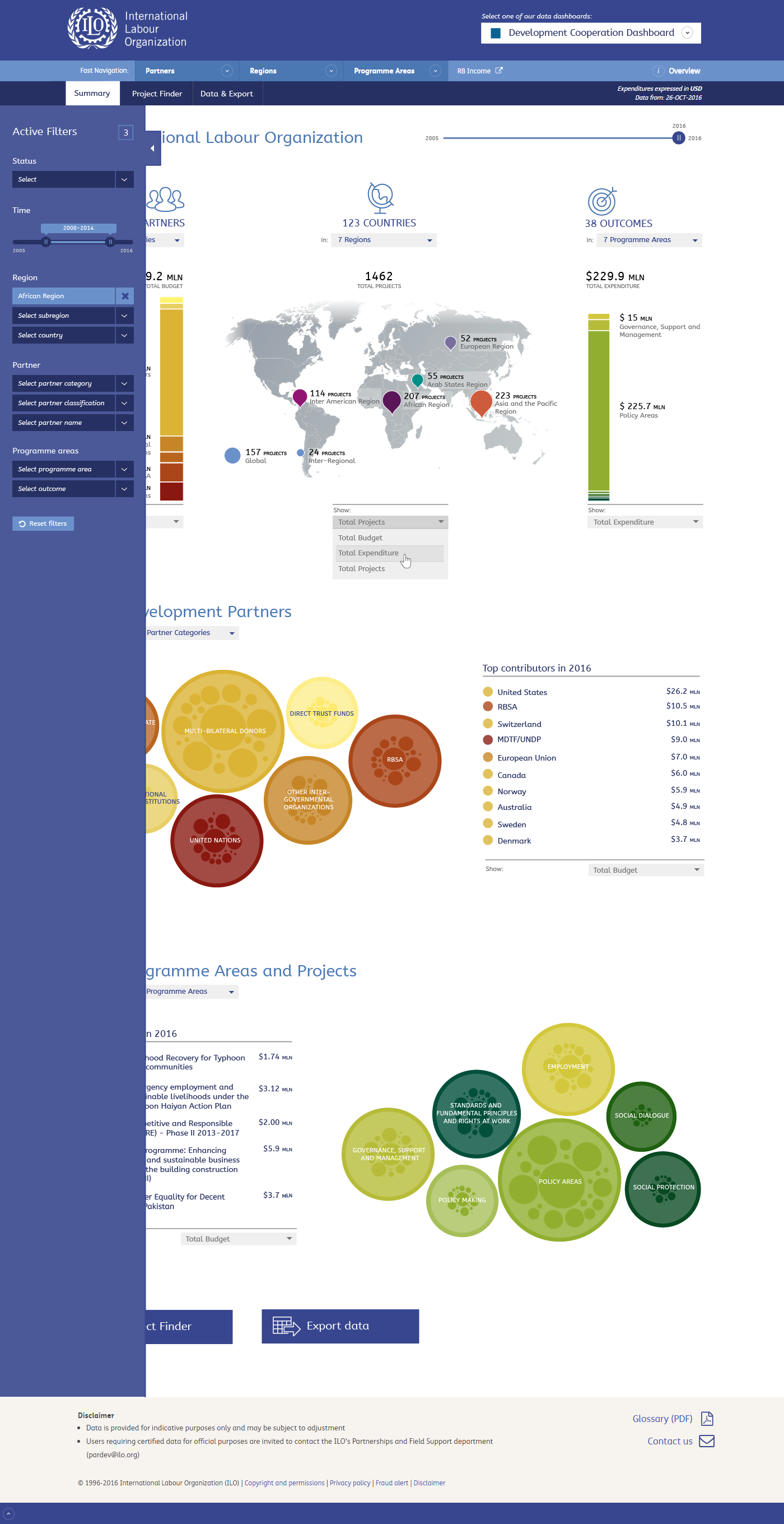
When the filter bar is opened a user can see what filters are active and change any of the filters. The page will be updated accordingly.
Note: the filters and the content on the page does not match in this design
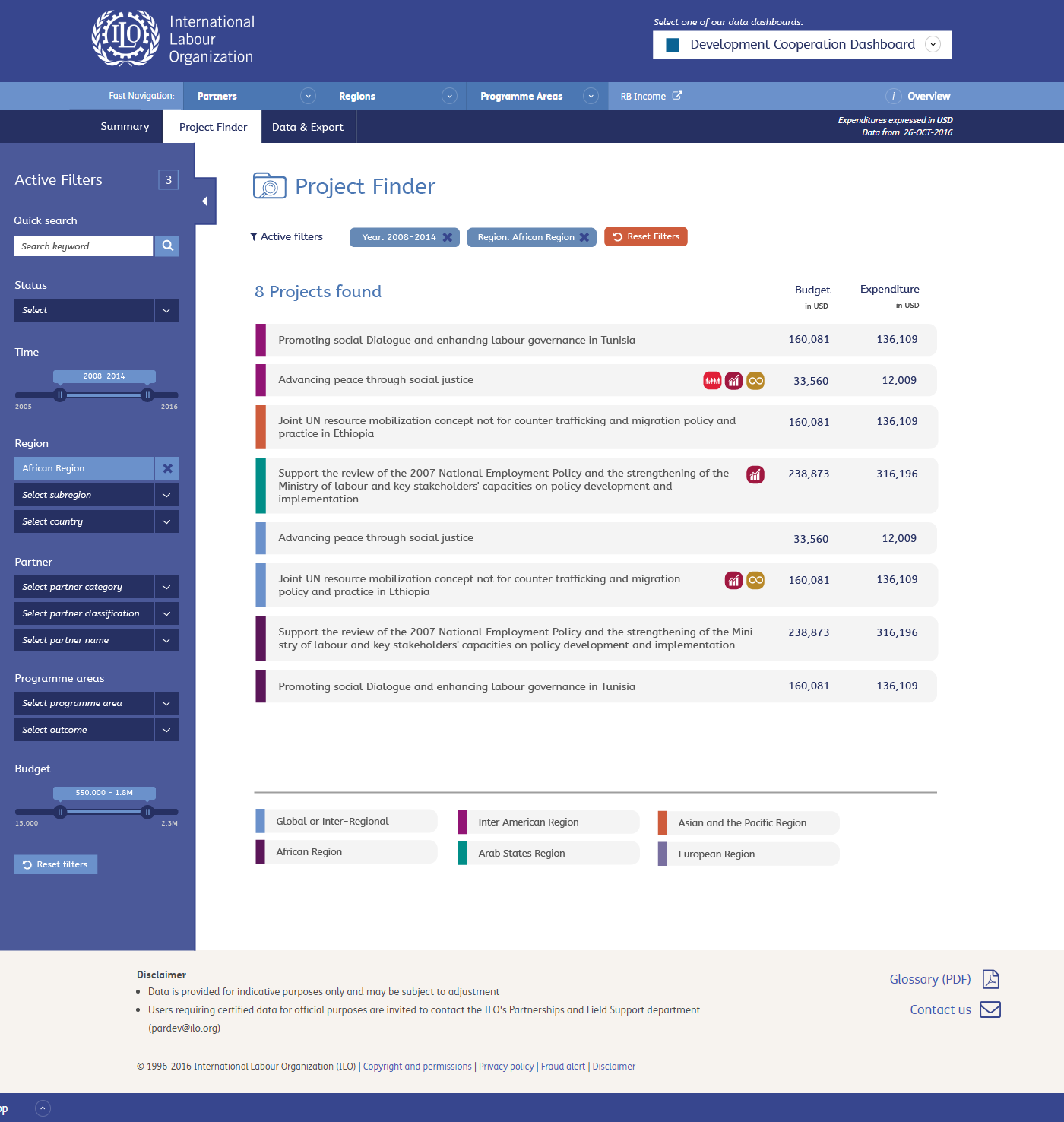
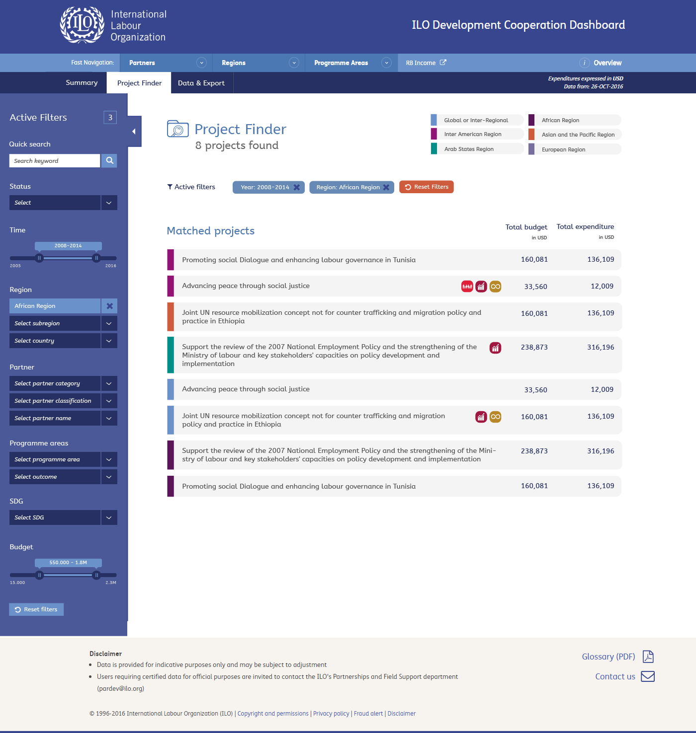
The Project Finder should not offer many surprises. I have added the region colours in the listing and limited the available filters from the previous design. Clicking a project will open the project page.
On this page the filter bar is opened by default
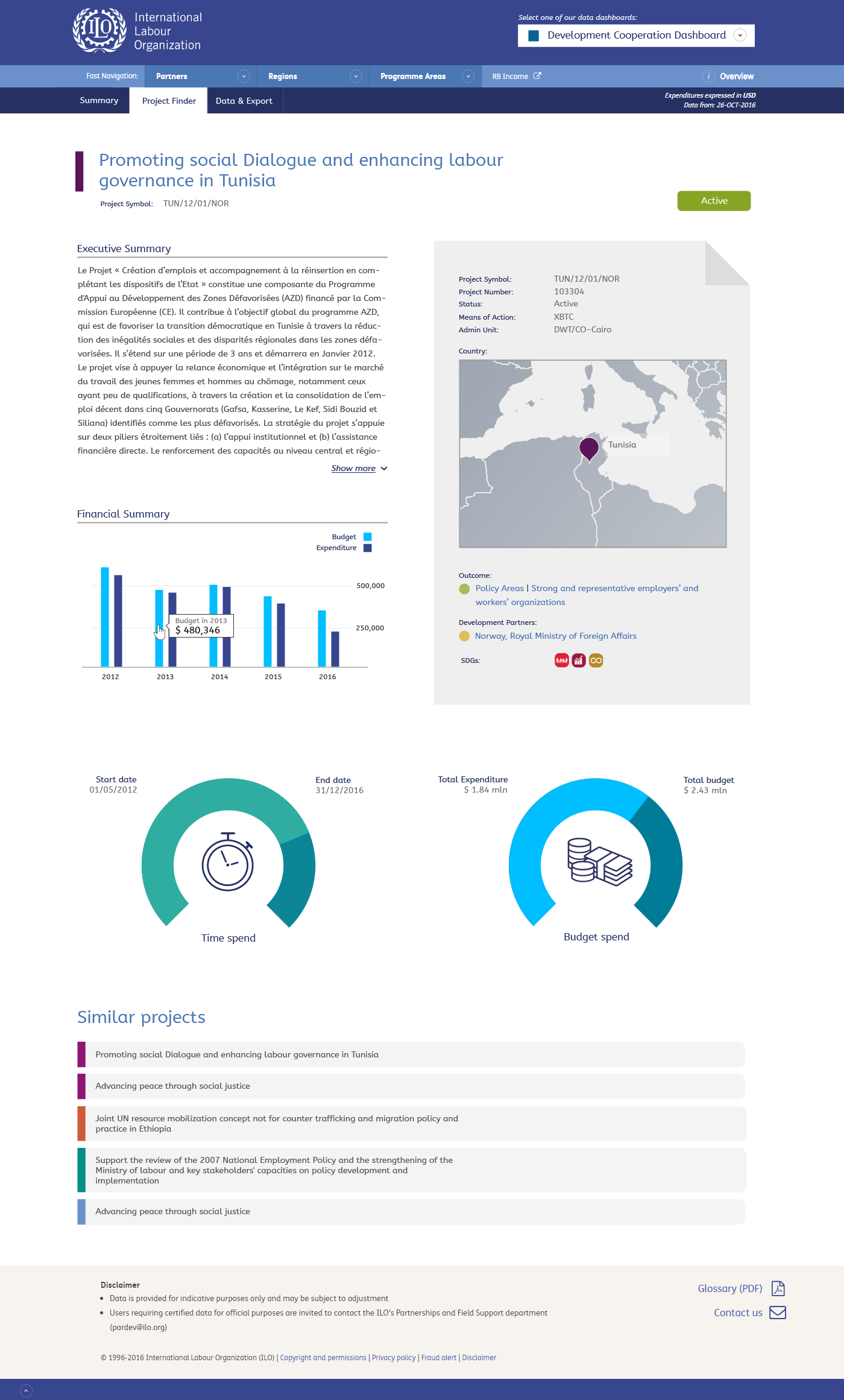
The Project Page offers all the information on a project. I currently have not included the documents yet, because I know very little about these documents and for that reason still unsure what is the best way to list them.
Mobile
I still have to make the design, but I kept 'responsiveness' of the pages in mind. You may notice that wide elements are presented in separate columns, which means they can be aligned vertically for narrow (mobile) screens.
The design does rely less on mouse-over functionality to get to the information, which will make it more usable for touch screens.
Update November 29
I shortly discussed the screens with Srini last week and he had a few suggestions for changes. The following slides show what we discussed.
The idea is to use the same elements ILO wide and for that reason it is preferred to use the original blue map. This image show how that would look like.
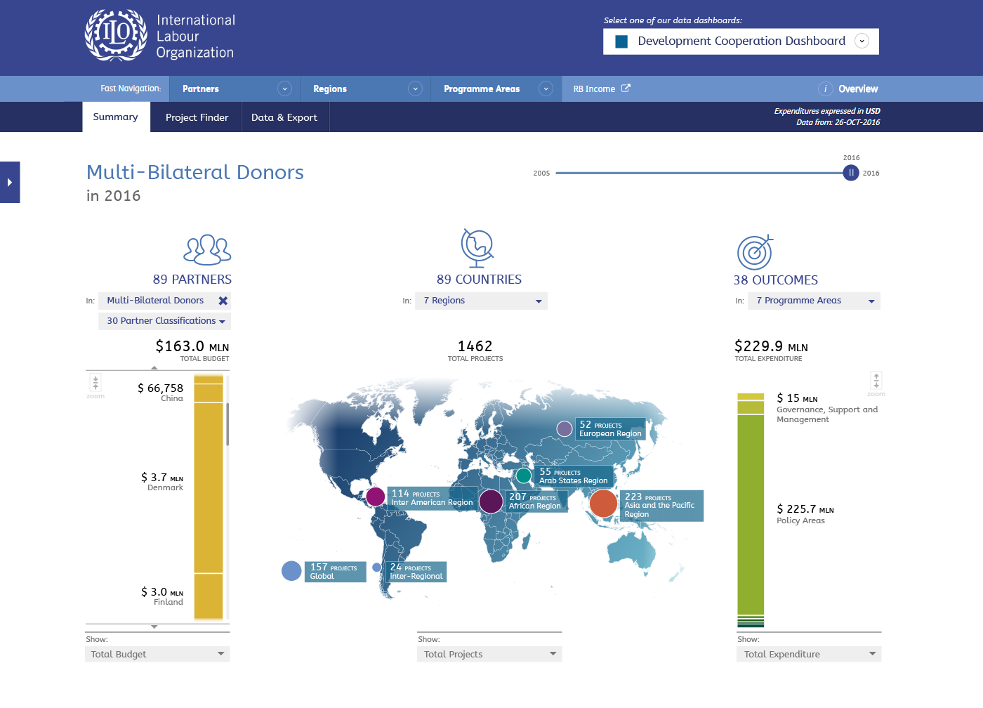
Srini raised his concern about the bar charts, where smaller ellement cannot all be labeled and for this reason some elements will become less visible. The reason for this approach was to be able to see the complete picture in a single screen. In an attempt to solve this issue I added a zoom function for the bar chart. When clicking the small botton next to the bar, the bar chart will zoom in so that each element can be labeled. This means the user will not see all elements in a single screen but has to scroll through them (as seen in the second image).
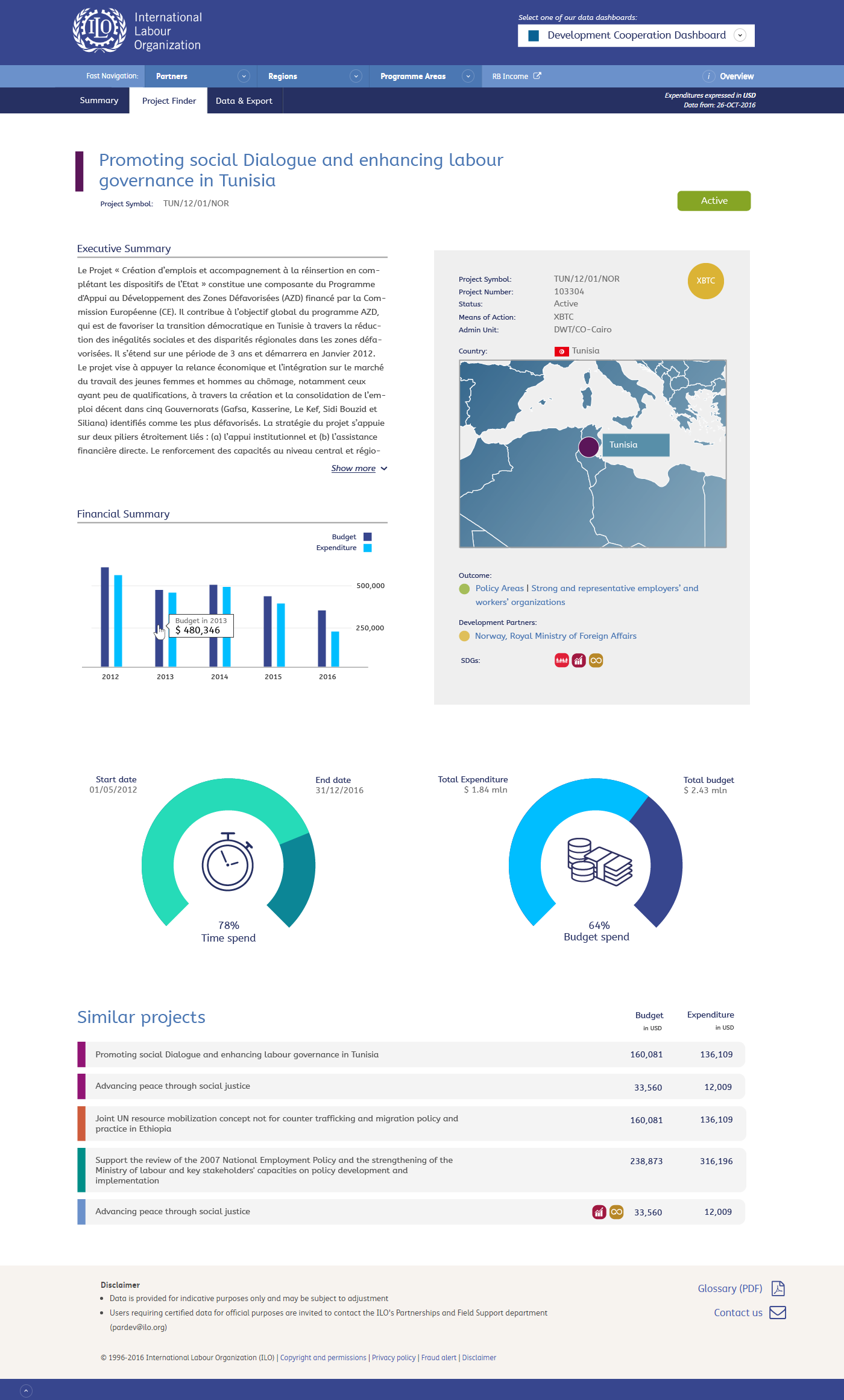
In the project page the folded corner in the top of the grey box caused some confusion. It was only a design feature, making the page look more vibrant. I now placed a circle indicating whether this is a XBTC or RBSA project. I also changed the map colour and Srini suggested showing flags for the countries. In the donor/dials I added percentages and changed the colours a bit (somewhat brighter). We can experiment with other colours as well of course. Finally I added the expenditure/budget figures to the list of similar projects.
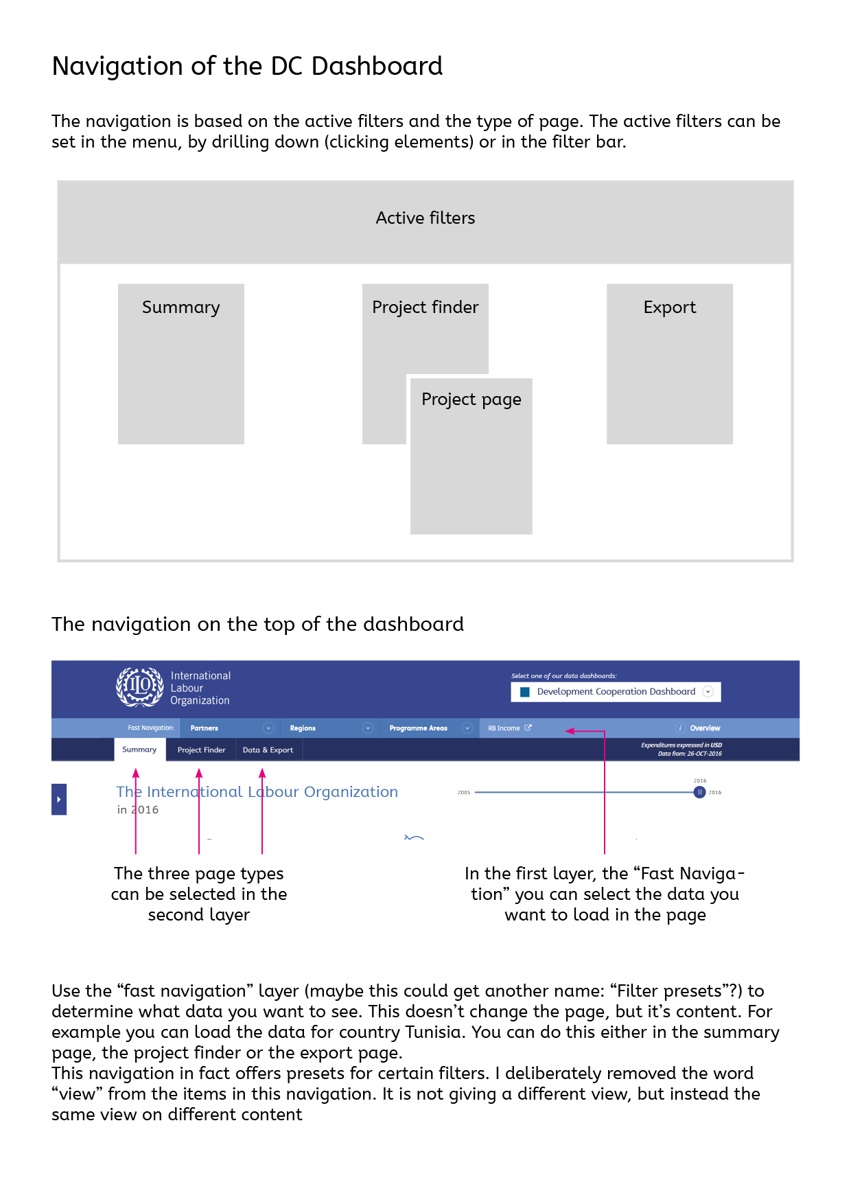
From just static images it is difficult to understand how the navigation is going to work. In these page I try to explain my suggestion for the navigation of the DC Dashboard. You can also download this document as PDF.
Finally a rough sketch to give some idea on how the mobile version of the Dashboard could look like. To experience this on your mobile phone, visit: http://www.zolabo.com/client/ilo/dc-mobile.html on your device.
Update December 2
Most feedback has been processed in the following designs. Some things remain open for debate, for instance what colours to use for the map.
You can download the feedback document including my remarks for your refference.
I decided to keep the counting of outcomes for now, if we want to remove it I suggest removing all counts. I added on the right side three icons for each section on the page. These icons will be fixed on the center of the page (so always visible) and can be used to navigate through the sections.
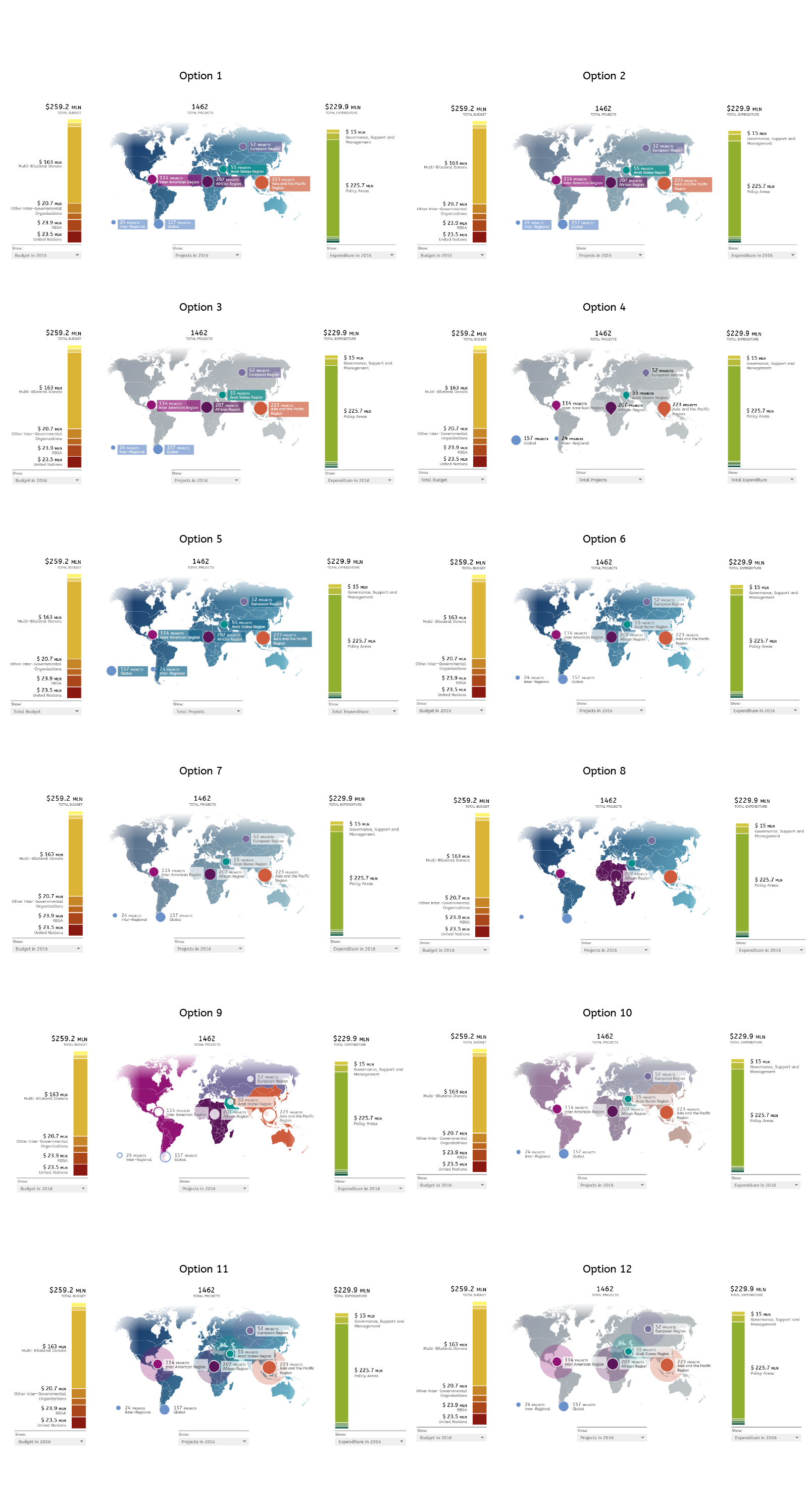
To help in make a descision which direction to go for the colours of the map I included several options in this screen.
Stories
There will be no stories. Clicking on the top level of the menu (partner, region, programme areas) will simply reset any filters and show the complete picture
It could also be an option to scroll the page to the section that matches the clicked item, but this is possibly somewhat confusing.
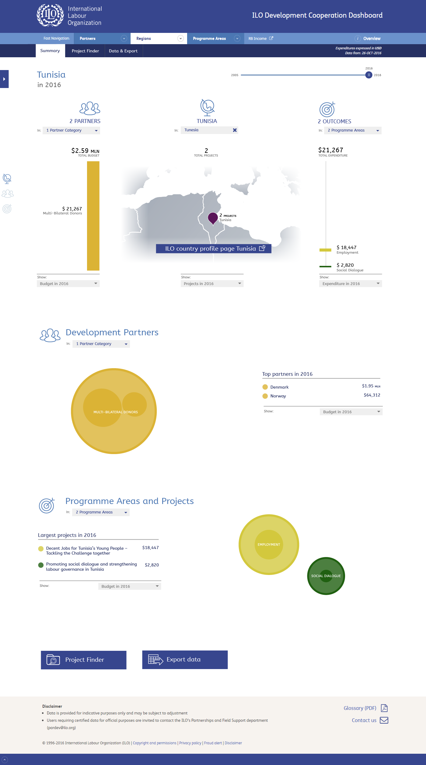
If possible we will add a link to the country page on the ILO website.
As mentioned before in slide 8 there will be a graph botton when the user has selected a range. This will toggle a graph showing the trend. This is shown on this slide.
We will add a filter for SDGs, both here as well as in the Project Finder. I just mentioned it as SDG because "Sustainable Development Goals" was a bit long. I'm not sure if this will be sufficient or we should add the full title somehow.
Here's the Project Finder with the legend for Regions on the top of the page and changed labels.
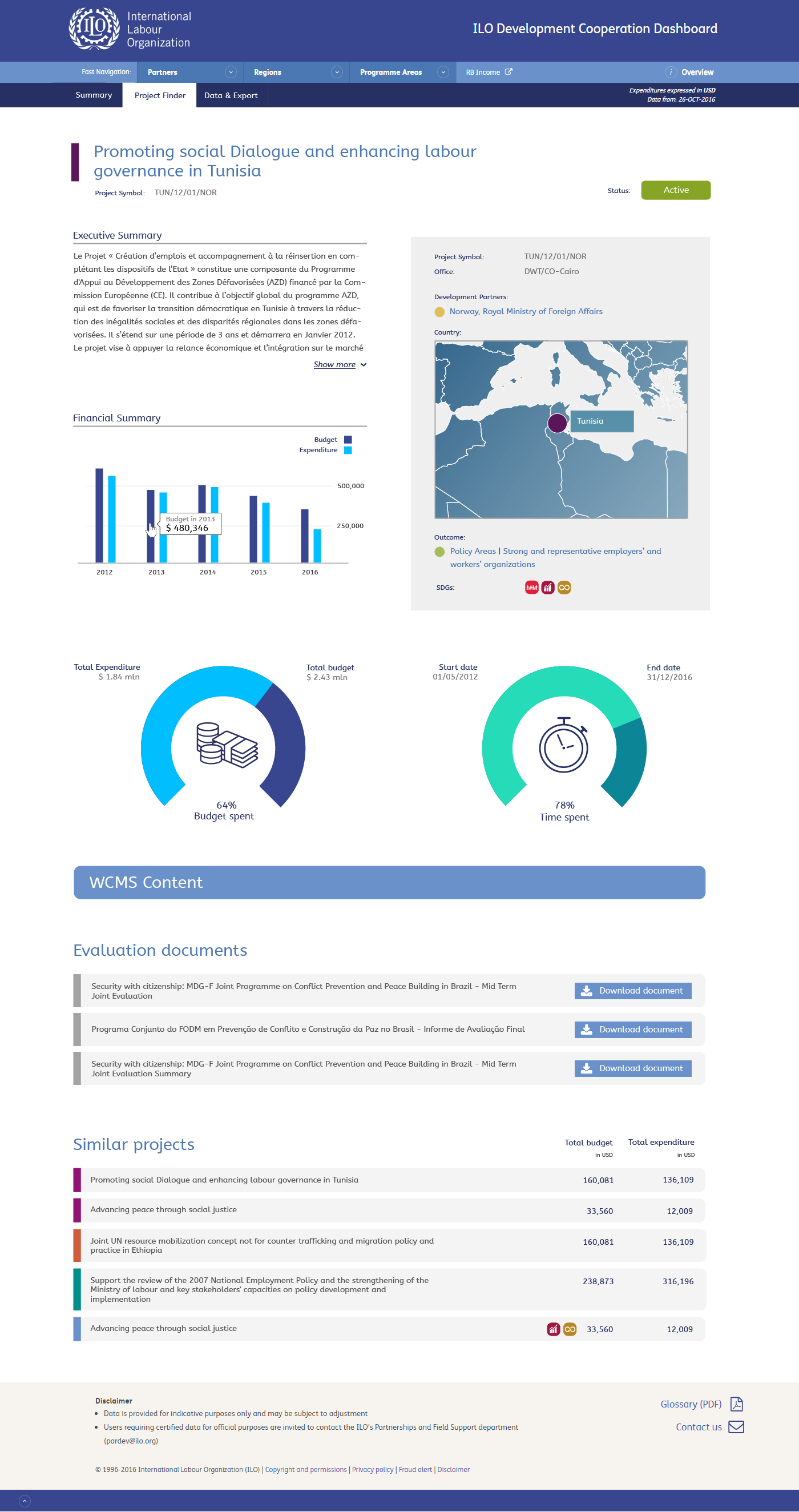
The updates project page. I have included the Evaluation documents. Clicking the button will open the document, it will not go to the Evaluation Dashboard. I have added a placeholder for "WCMS Content", when I have a better idea what this contains I can design something for it.
Update December 9
Some feedback from December 6 are processed in the following slides. Some open question remain.
You can download the document with feeback and questions/remarks.
A grey map, the zoom buttons for the bar charts removed as well as the navigation icons for each section. Clicking the top level in the navigation ("Partner", "Country" or "Outcomes") will bring you to the different sections.
When you hover an item on the map, it will be highlighted in the colour of that region (please let me know where to find the correct colours)

When you select a range of years in the time slider a toggle button will appear. This allows the user to switch between the map (default) and the graph that shows the trend between years (next slide).
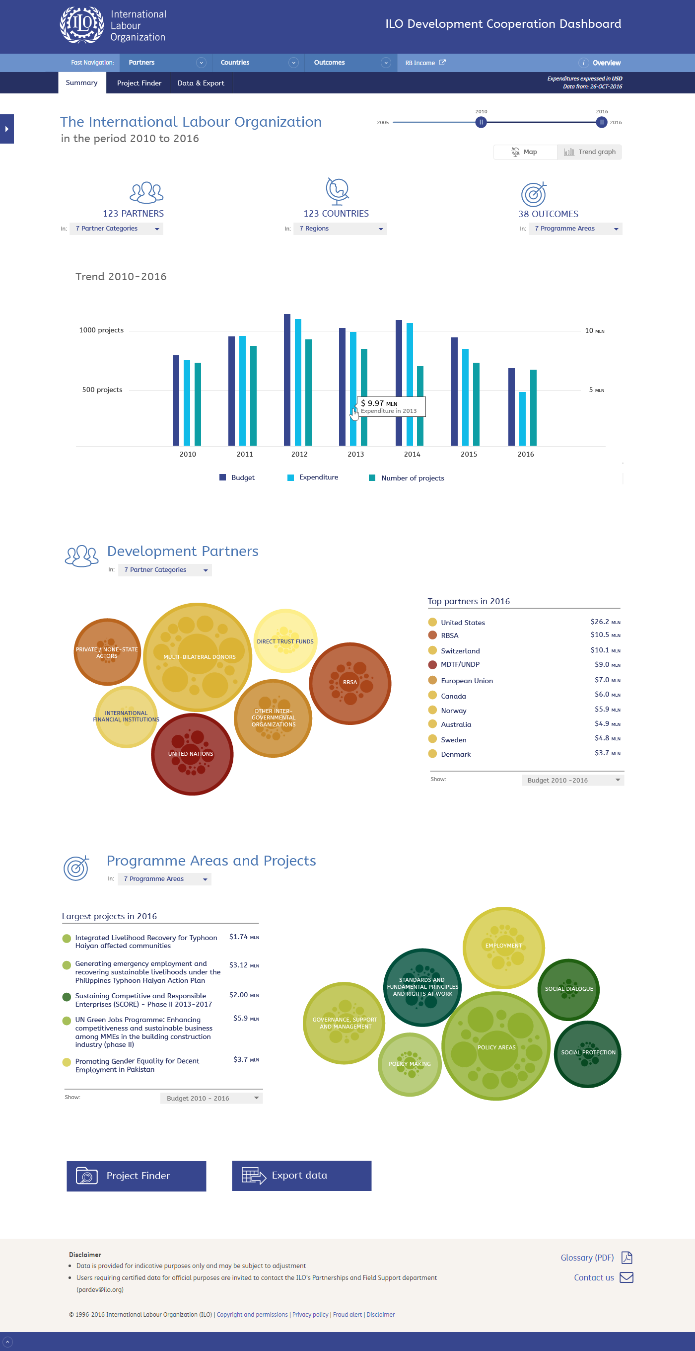
The graph. You can toggle back to the map by using the buttons bellow the slider
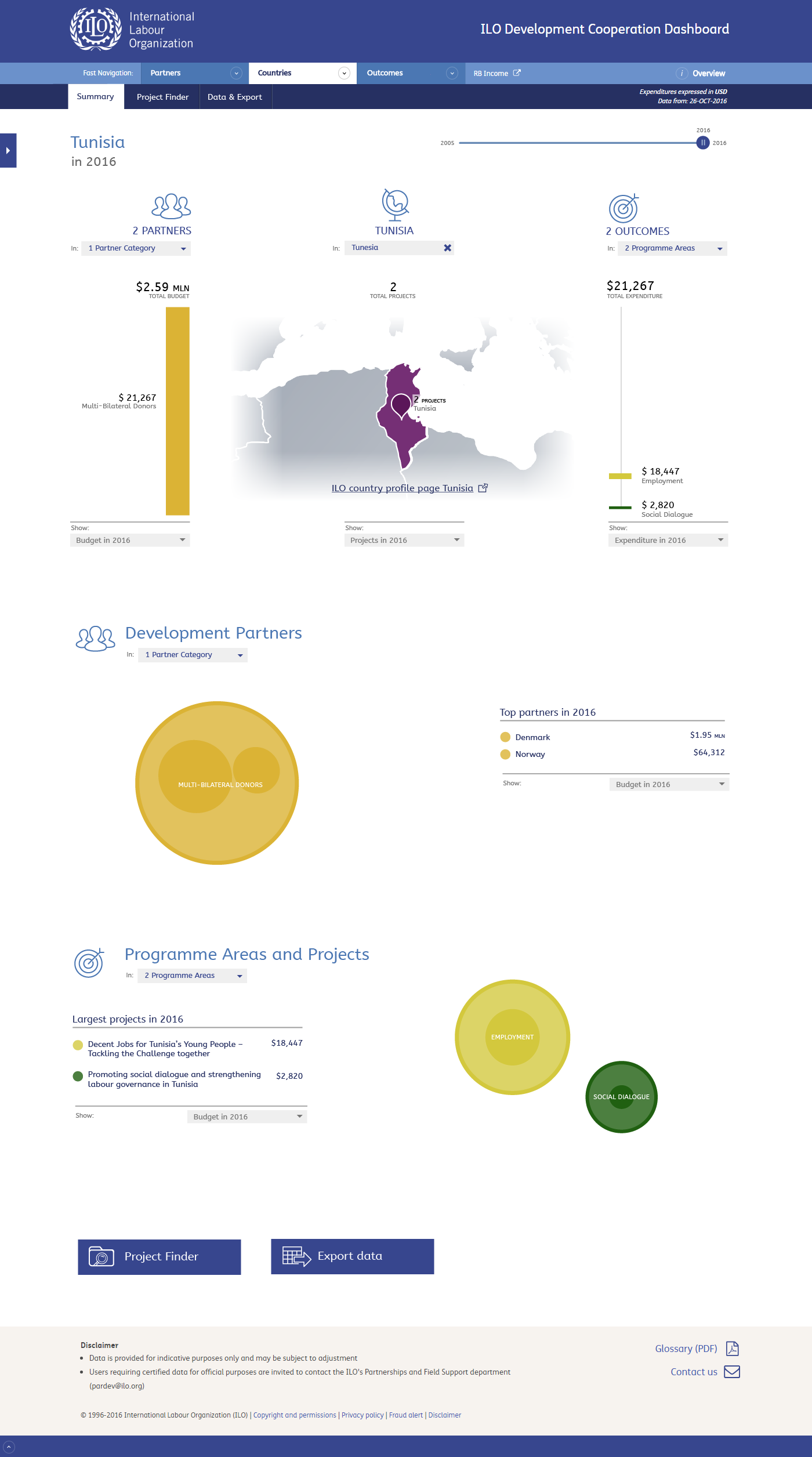
In the country page I still used a new element to link to the country profile page, however I made it more subtle. We can also add this link to regions. Please do note that I'm not yet complete sure if we can reliably create these links at all.
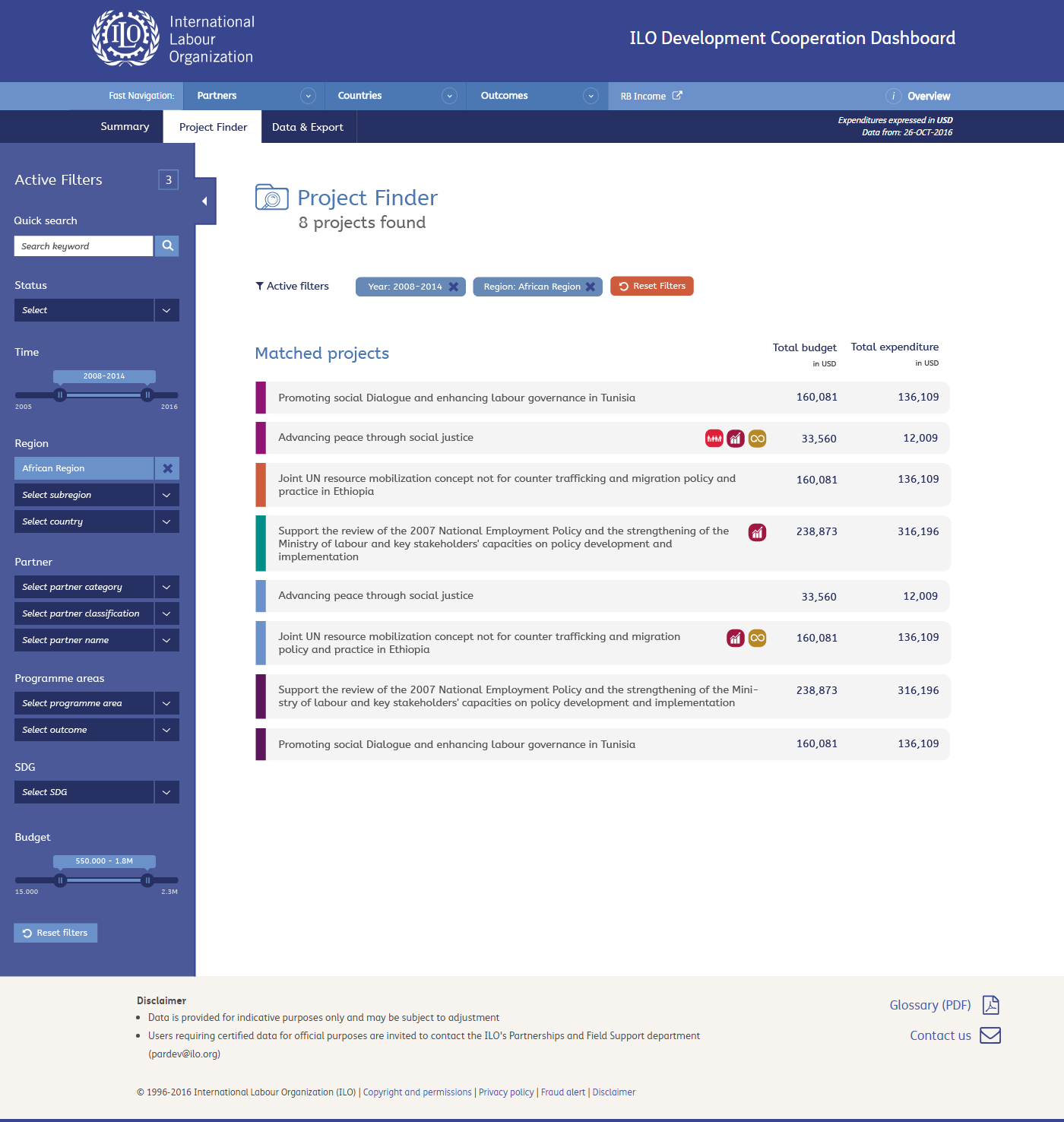
The project finder with simply the legend removed.
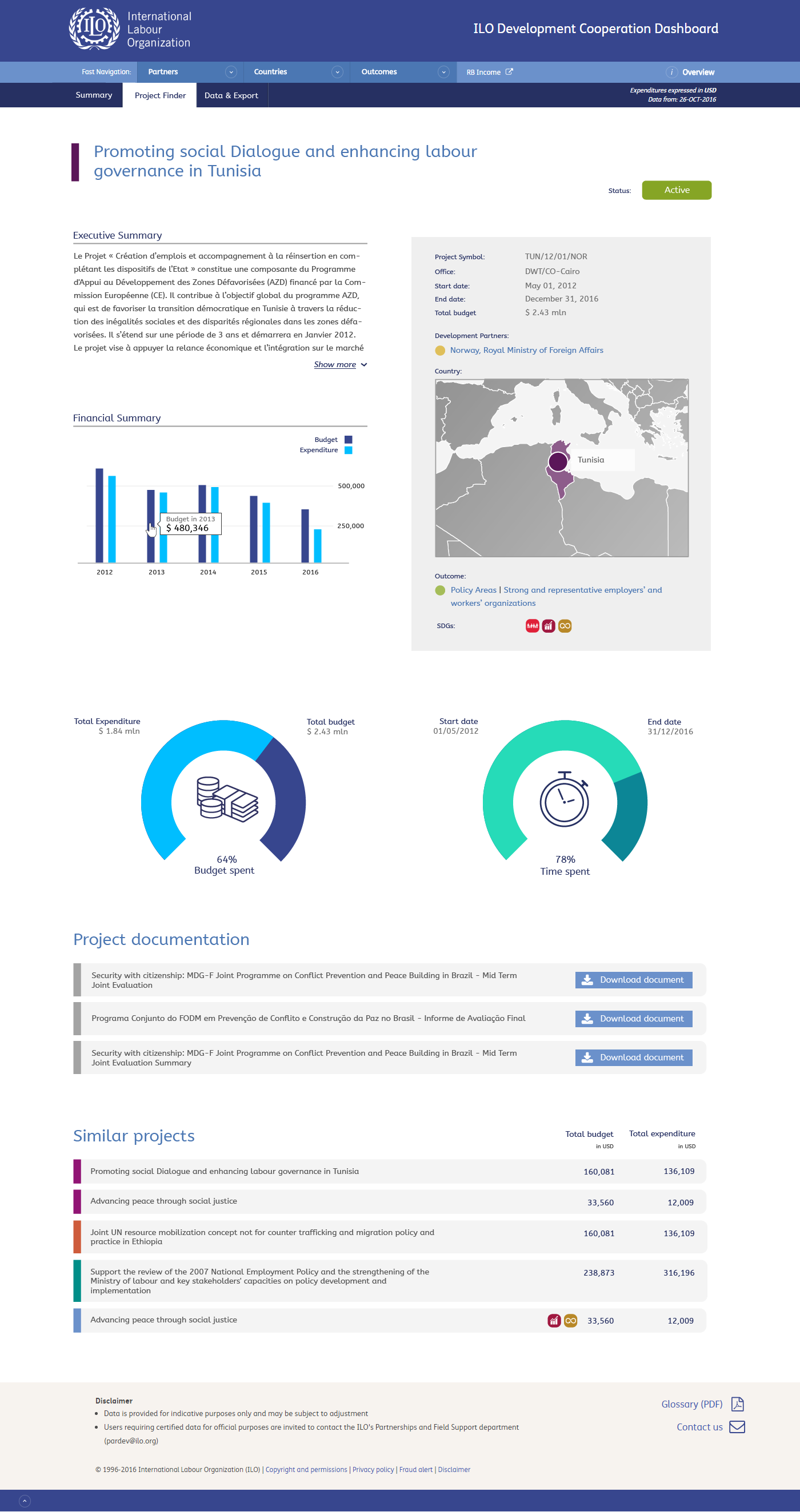
Removed the project number below the title, added some values in the box and merged the documents into one section "Project documentation".
Update December 12
In addition to the update from December 9, the following slides contain some small modifications based on the provided answers.

I updated the region colours. I kept the "active filter" bar in this screen for now. I have to create it for the Project Finder anyway, so its not much to include it here. I suggest once we have a working version we just try whether it is useful of confusing and then decide whether to keep it or not. Same for the counting at the top icons, its simple to remove them later. We can then also experiment whether adding a link to those icons is something we want or not.
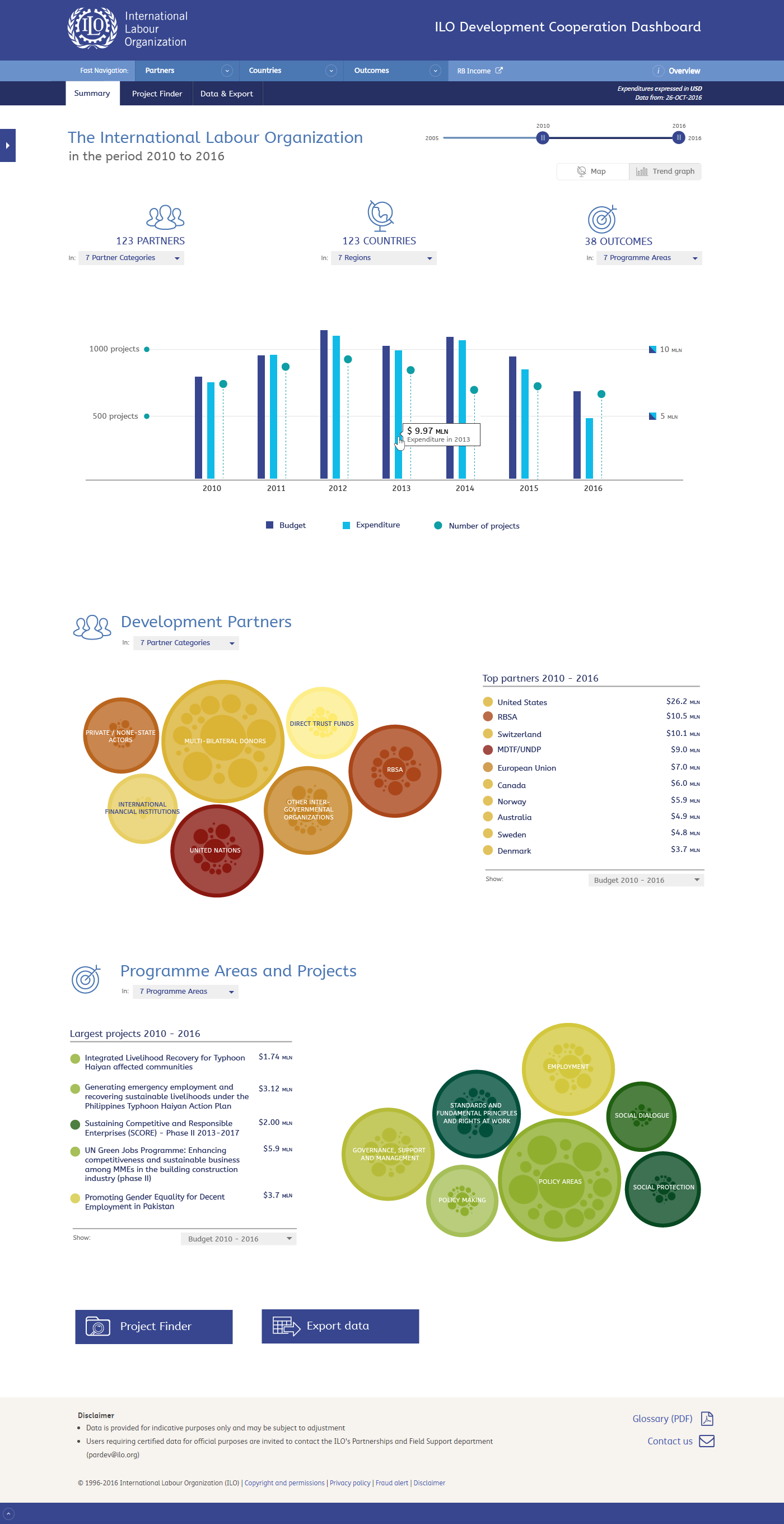
I changed the representation of the number of project so it's more clear that it uses a different axis.

For the country page I made the title of the page a link. I used the "external link" icon (this is kind of a standard and it also used at the ilo.org website for external links). I think the ">" character would suggest it is a link within the dashboard. I think this can work, my only concern is that it still might not be clear enough for users what they will get when they click. I can add a tooltip with something like "Go to the ILO country profile page", giving those using a mouse a better idea where the link leads before they click it. I think we can try this first and an alternative could be to add a small link just behind the title.